
About
For this project, I worked closely with my husband to identify the needs of his patients and the discrepancy of available resources when it comes to saving for dental care. As a dentist, he frequently meets people who are unable to pay for dental care, especially with the rising costs.
With their financial sensitivity in mind, we wanted to create a helpful mobile platform that would allow them to save, pay and book their dentist all in one place.
Project Role: UX Design & Research
Project Duration: December 2021-February 2022
Skills & Software: Quantitative Research, Storyboarding, User Persona, User Journey Mapping, User Flow, Wireframing, Prototyping, Component Building, Design System, Adobe XD, Adobe Fresco
Problem Statement:
User feels the stress and burden of paying for dental care (often avoiding visits) and needs a platform that could help them save money for forthcoming dental emergencies or routine checkups. I wanted to create a platform that would encourage them to save for their care, pay their bills, and schedule appointment all in one.
Final Screens


Visuals & Interactive Components
-

Welcome Page
For the welcome page, I wanted to have a clear and captivating experience. I used my marketing background to highlight the 3 most valuable features of the app. Then, I sketched some fun illustrations and created an interactive slideshow. Money topics can be stressful, so I wanted to create a fun brand, tone, and visuals for the app to ease some of the users’ worries and create a lighter tone.
-

History Graph
I wanted the users to have a simple way to view their savings and history spending. Both graphs display the amount saved per month, a drop-down selection to modify the date range, and a toggle to easily switch between the saving and spending state.
-

Calendar
Some of the screens use a date picker/calendar feature. For this component, I designed a calendar that includes a nice open animation and hover affect.
-

Add Deposit & Search
From the Home Screen, the add deposit button has a nice effect when hovered/clicked. Additionally, the search icon expands to a search field when clicked.
-

Typefield
For the type field, I designed the effect of the label text moving upwards as the user clicks on the field. This way, the user can see the label at all times, with minimal clutter on the screen.
-

Savings Goal Slider
For the savings goal slider, I wanted to give the user an option to adjust their yearly savings goal. When adjusting this goal, they also see their monthly payment changing. This way, they can adjust what fits in their yearly or monthly budget.
Design System
The design system offers a comprehensive list of all the elements used within the design. The sections within the system are: Color, Typography, Buttons, Navigation, Cards, Forms and Icons.

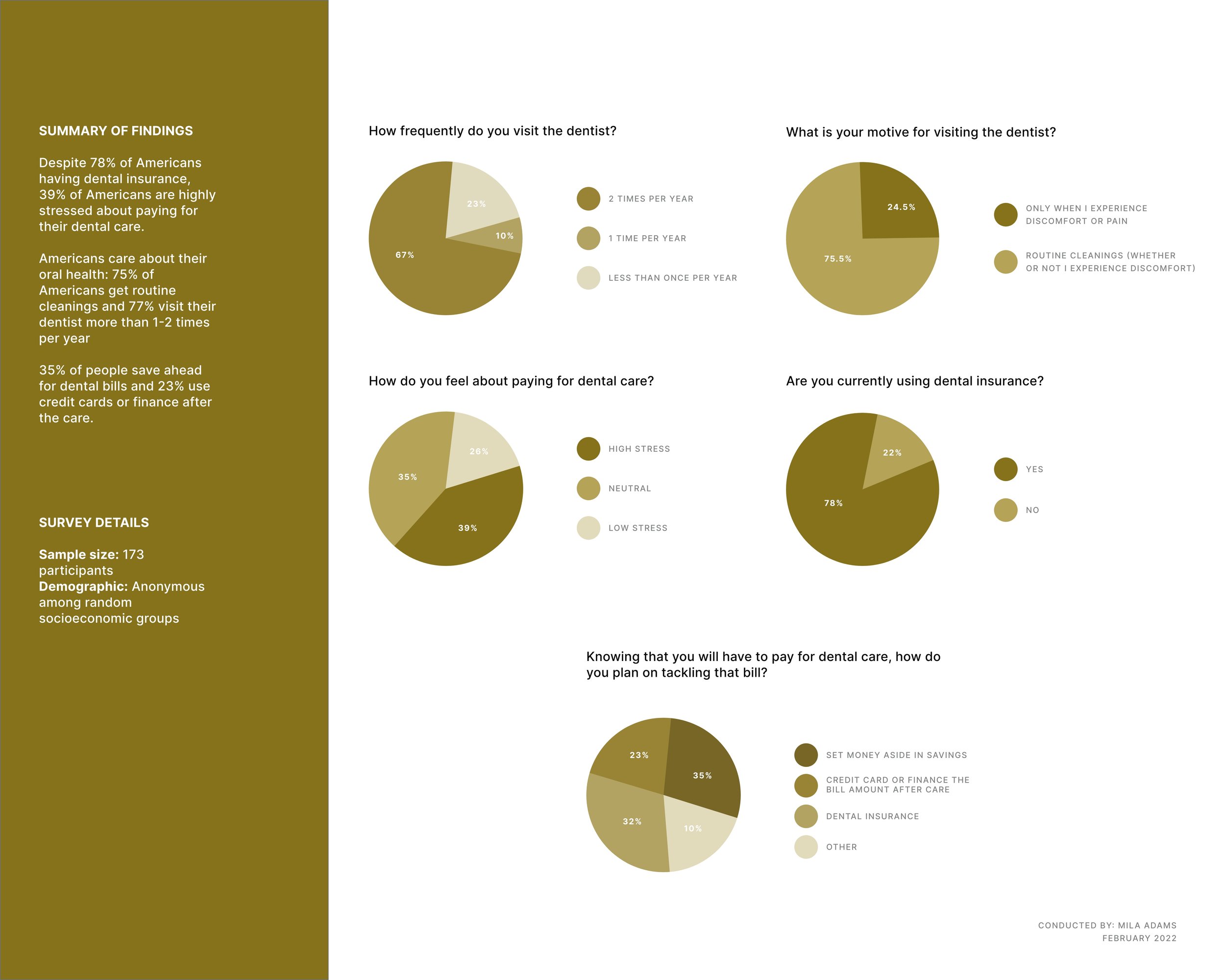
Quantitative Research
To begin my study, I conducted a survey with 173 American participants from various socioeconomic backgrounds. I knew there was a need for this type of app, but the information I had was from my husband and his perspective. It was a building block, but it wasn’t enough to conduct further research. This is why I wanted to have a large pool of people participate in the survey. I synchronized the results into a visual and a summary of my findings.
User Survey Quotes.
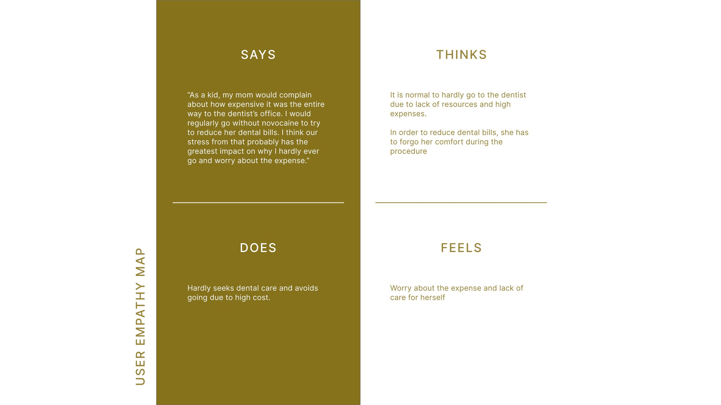
My survey included some open response questions. These are the most impactful quotes that I collected from the users. I found that a lot of the open-ended responses included emotional responses about the stress of paying for dental care. This further supports my hypothesis that Americans need a helpful resource in helping them manage their savings and spending. We can’t control the price of dental care, but we can give people a resource to help and alleviate some of their stress.


User Personal
During the survey, I wanted to respect the anonymity of my participants so I left it for them to optionally leave their email. Luckily, a participant of an impactful answer left their email and I was able to contact him for more questions and to build out a user persona. I synchronized their answers to display on the visual (left). This really helped me empathize with the user and start thinking of some valuable features for the app.
These are the things I asked the participant:
Background (age, occupation, demographic)
What steps do they take towards saving for their dental expenses?
What care did they have in their early years?
User Empathy Map
To further build on the user persona, I build out a user empathy map after speaking to the participant of my survey.

Ideation: User Journey Map
To begin the ideation process, I started with a User Journey Map. I needed a clear and detailed outline of what the user journey looks like. This is one of my favorite processes to build, as it helps me visualize the platform and organize the steps that the user will take during their journey.
While writing out the user journey, I dropped down some ideas for areas of improvement. Analyzing their feelings during each step, helps me brainstorm improvement opportunities. User journey mapping is a great way to write those initial ideas that later on can turn into valuable features.
Big & Small Picture Storyboarding
Before moving into the user flow, I quickly sketched out 2 storyboards: big picture and small picture. The big picture showed some of the feelings that the user may be feeling through their journey, which helped me identify those emotions and notice some pain points. The small picture showed the specific path the user would be experiencing on their device.


User Flow
During this phase, I created 3 flows that are the most important for the platform:
Being able to add a deposit into ‘the wallet/saving account’
Being able to find a dentist in their area and choose them as their default provider
Being able to pay an incoming or outstanding bill straight from their wallet
In my user flow chart, I outlined each step that the user would take during the app flow. Each step is identified as either an action, clickable button or screen name. I realize that this is a good stepping stone into drawing out wireframes because I can visually see what screens the user is going through and what actions need to be taken in order to get from start to finish. I can see some basic ideas forming, but there is still a lot of work to do as I prepare to find valuable features.


How might we & Value Propositions
To get in the right mind of finding value propositions within my new platform, I did a quick ‘How might we?’ exercise. I set a timer for 2 minutes to come up with as many questions as possible. The questions were flowing. As I read back through them after the time was up, I was thinking of some different features that the user may find valuable during their experience. Some of the features answered multiple questions at the same time, so I deemed them as more important. For example, I knew I wanted to have a history chart where they can see their progress, which answered questions 2, 4, 7. This leads me straight into value propositioning. I wrote out as many features as I could think and grouped them into common themes.

Paper Wireframing
Crazy 8’s
To kick off the paper wireframing process, I sketched out some crazy 8’s. I separated my paper in 8 equal parts. With a minute timer set, I started drawing out as many ideas as I can possibly think. After getting some creative juices flowing, I started picturing some of the designs for various screens in my head. Some of them made sense, others… not so much. Either way, I went through my designs at the end of the timer and ‘starred’ some items that had potential.

After sketching out some of the designs, I knew I had to get more specific. So using my user journey map from earlier and ideas from the crazy 8’s, I started outlining different screens. For example, from my journey map I knew that a user would need to land on a welcome page as they begin Flow 1. So I started designing there. This is why journey mapping is so useful and important in my process.


Paper > Lo-Fi > Hi -Fi
After sketching out screens, I pulled them into Adobe XD to begin making the lo-fi wireframes. I used basic shapes and lines to signify text, buttons, logos, and other components of the screen. This is a quick process to get organized and ready for hi-fi mockups. Seeing them side by side also makes it easier to do quick placements. I repeated this process for each one of the paper wireframes that I had drawn out earlier (pictures above in a slideshow).
After getting all of the lo-fi wireframes completed, it was time to start thinking about design and components. I wanted to start on those as I was working parallel in creating the Hi-Fi mockups. It is easier for me to create some of the components first. Then, I can simply place them within the Hi-Fi mockups. Of course, this is a very long and complicated process. As design ideas change and then I had to go back through the components. Lots of repositioning, change out the font sizing and modifying the design system as I went along.

Design System
While creating the design system, I wanted to grow my knowledge and get more organized when creating components. This is something I have done in my previous projects, but I don’t think I’ve gone to the extent and details like this one. I even added a navigation bar to the design system itself so it’s easy to browse and locate various components.
Since this project didn’t have defined branding, I had to come up with some of the ideas myself. In an effort to keep it pretty minimal, I went with 1 main color (in various hues/opacities), 1 contrasting color and 1 error color. Picking green was a no-brainer since it’s associated with wealth and money, however, I picked a more muted green (as opposed to something more neon).

Prototyping
This stage was connecting all of the screens together, as well as refining some component animation. Making sure everything flowed seamlessly was my end goal. I wanted to make sure that during the testing phase, the participant could have a realistic experience (despite having some limitations of the software). Working more in Adobe XD, I had a lot more flexibility with some of the features than I did in Figma. It was good to hone in on some new skills and try out new design ideas (like a whole new way of animating the buttons).

Designing for Accessiblity
As I made my designs, I wanted to make sure to touch on accessibility points. Some of the things I included
All text and components met the AA contrast grade
Noting down alternative text for images and icons so they can be easily read by screenreaders
Large icons with a touch target at least 44 x 44 pixels
Medium to large text throughout the platform
Simple and understandable UX writing, avoided any jargon or slang
Very straight forward directions and flows
In conclusion
-
My next step and number one objective is to conduct a usability study for my prototype. Since this is a time-consuming process, I wanted to make sure to post the case study with its valuable research and designs. I’m currently in process of recruiting participants and hope to post the study and any design changes soon.
-
My biggest win was nailing down an intimidating software - Adobe XD. I found it very flexible and capable, which I really loved. This software is also very clean, which inspired me to be more minimal with my designs. You know that feeling of extra productivity and inspiration when you have a clean office & desk? This is how I felt about Adobe XD.
-
My biggest challenge was building a design system from scratch and working with the components. I won’t lie, there was a learning curve and a lot of frustration. I put an extra amount of hours in crafting the designs and components that I felt proud of.
Thank you for reading! Come back soon to see the results of my next steps.