


Research: Understanding the User

Before diving into any design processes, I needed to establish the “WHY?” and vision behind this project. Who am I creating for? And how can I ease their experience?
There is a market of parents out there, who need flexible daycare centers, with the ability to work near their kids for easy access (and peace of mind). Similar to a gym with daycare, but instead of working out… we are just working.
Before diving into user interviews, I outlined the questions I want to ask and my objective.

After interviewing 5 participants via Zoom and FB messenger (recruited from working parents groups), I made notes of their highlighted quotes. Then it was time to sync all the data by similar themes.


Then it was time to build a user persona. The demographic points are make-believe to better visualize the user. However, the frustrations, goals, and the quote are all data pulled from the user interviews (Finding common themes - above). As you can see, I use one part of research, as a building block for the next part, in order to narrow down my scope.
Research: Competitive Analysis
To learn more about the market, I conducted a competitive analysis with two objectives.
How do competitors structure their sites and highlight value through design?
How do competitors improve user experience through their UX/UI?
I picked 3 competitors and analyzed their sites. Below you can find the summary of the strengths and weaknesses of each competitor, as well as the summary for each objective.


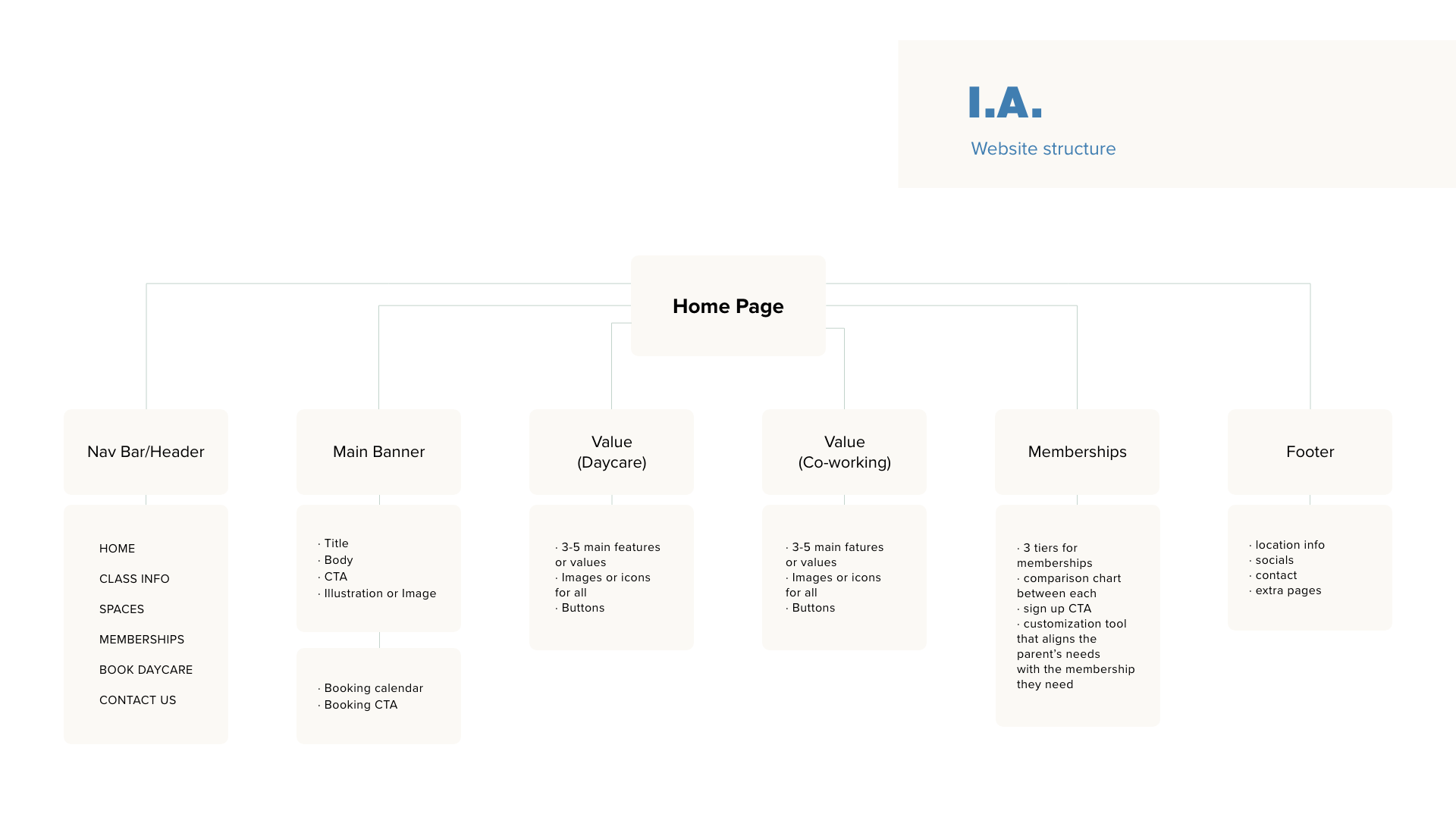
After studying competitive analysis, I created an Information Architecture breakdown for the site, in order to better organize the flow of the website.
Design: Wireframing
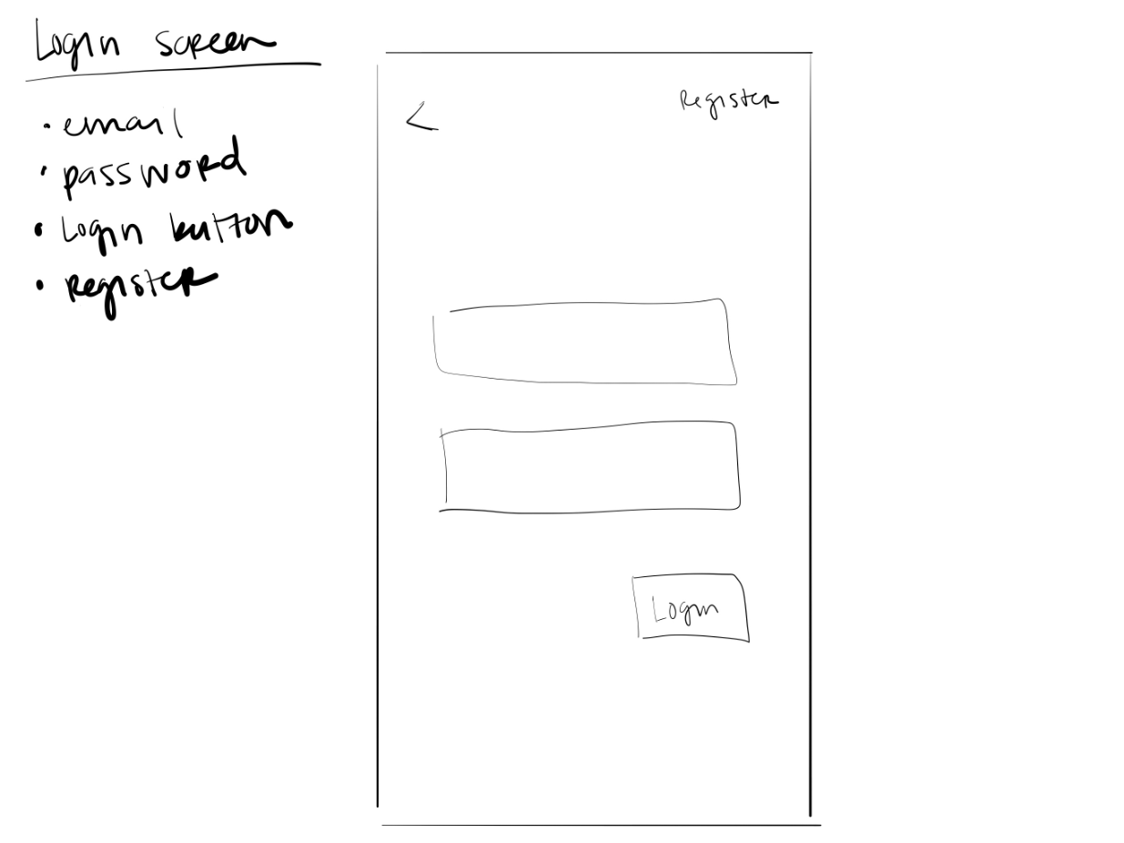
I used my iPad to quickly sketch out some designs of the various segments I wanted to have on the main page of the site. As well as a rough outline of what the booking flow would look like on the site. This helped me be able to create a lo-fi mock-up without spending an extensive amount of time.


Next, came the high-fidelity of the home page. This is when all the creativity comes out. I separated the front page in segments and made all the information easily digestible.
I strongly believe that it was enough info to create value around the space, but not too much where it might overwhelm the viewer.
Along with the home page, I also created a booking flow for the daycare and scaled it to the phone app size (can be seen in deliverables at the top).


In conclusion… Thanks for reading!
-
Wins
This was the strongest design project, as I explored all the principles of color and spacing. I was able to use more Adobe Illustrator and Fresca to focus on my illustrating skills, which I hope to grow further.
-
Losses
Since this was a side personal project, I wasn’t able to properly dedicate the time to prototyping and user testing. Fortunately and unfortunately, I started my UX job, and wasn’t able to take it to the next level. Understandably, my focus fell into other places.
-
Next
When time allows, I hope to pick it up to the next phase: creating more screens (confirmations, more pages) and prototyping.