
WheelnGo is an interactive bike shopping app that offers users personalized bike recommendations generated by our metric. Users can plug in their personal measurements, and the app will recommend bikes ideal for them. Thus, making shopping simple and easy.
Project timeline: April 2021 - October 2021
Project role: Lead UX Designer (UX Design Certificate though Google)
Software used: Figma, Adobe XD, Adobe Photoshop
Skills Used: Research, Ideation, Design, Usability Testing, Wireframing, Prototyping, Creating Mockups, Design Systems & Components & Exporting to Development
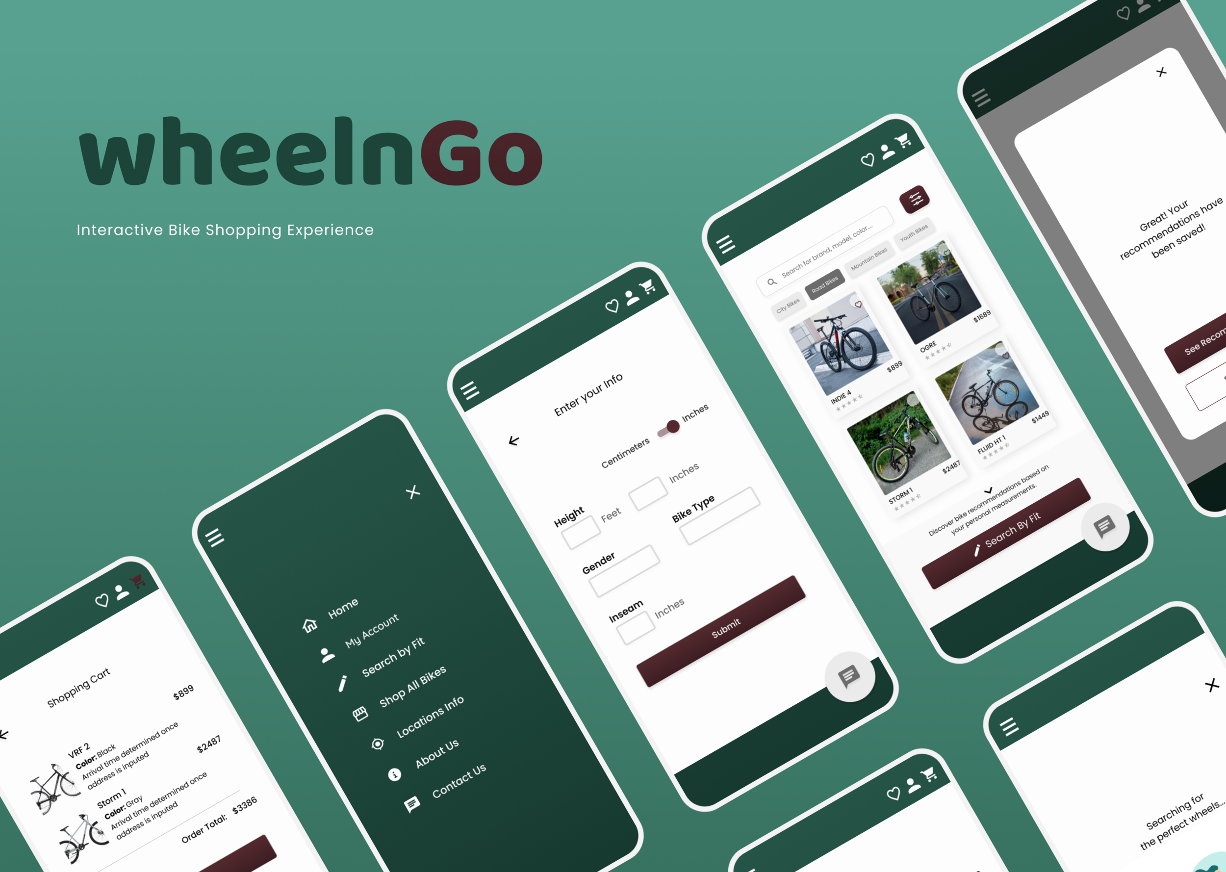
Final Mockups
-
![]()
Menu
-
![]()
Home Page
-
![]()
Search by Fit
-
![]()
Loading Page
-
![]()
Account Login
-
![]()
Product Page
-
![]()
Shopping Cart


Sticker Sheet

Sticker sheet includes iconography, typography, color swatches, components and animations.
Research and Ideation Workflow
-
![]()
Primary Research
For my primary research, I conducted user interviews with 5 different people ages 18-25. These people have previous experience with bike shopping and hobbyist or professional cyclists. I used leading questions to understand their bike shopping experience and recorded their answers to further analyze the data.
-
![]()
Secondary Research
Secondary research helped me understand what bike specs users look for, the filtering system they use, and examples of informational architecture. This broadened my knowledge of what shoppers look for when they search for the right fit for their bike.
-
![]()
Competative Audit
My competitive audit was conducted for 3 local bike shops in Toronto. The audit included various sized businesses, their unique value propositions, and analyzed ratings for site first impression, interaction, visual design and content. All findings are neatly organized in documents for further ideation purposes.
-
![]()
User Empathy Maps
Through user empathy maps, I was able to define what the user says, does, feels and thinks for each user I spoke with during the interview process. The user wanted to feel more confidence with their purchase. This can be achieved by giving them the right tools for making their selection.
-
![]()
User Personas
Using the data from my interviews and empathy maps, I created 2 user personas for the common and prioritized pain points that users experience during their shopping process. This helped me define the problem statement for both personas.
-
![]()
User Flow
After outlining the user flow, I determined that it would be in the best interest of the user to give them two baths to browsing and purchasing the products. One path would be designed for those who know what they’re looking for and want to browse all products (or use the search feature) and the other path would be for those who need more help and can enter their personal measurements to generate bike recommendations.
-
![]()
Journey Maps
By compiling a detailed user journey map, I was able to see areas of improvement in the journey and features that the user would find valuable. This motivated me to simplify the bike shopping process by providing an interactive way that shoppers can input their measurements and a formula would present them with bikes that would fit their measurements.
-
![]()
How Might We
Using the timed written exercise “How might we” I wrote out as many questions that I could think of that would elevate the user experience. This helped me focus on features that the user may value and begin brainstorming ideas.
-
![]()
Value Propositions
After outlining value propositions, I was able to answer questions such as “What does the product do?” And “Why should the user care?”. I compiled a list of features that would solve the user’s pain point, which would in turn create value for the user.
-
![]()
Storyboarding
Storyboarding defined why and how the product will be useful to the users. By using the problem statement and a goal statement I can see how the user would successfully achieve his goal and what steps (s)he needs to do to get there.


Wireframing

From paper…
Using paper wireframes was an effective, fast and inexpensive way to draw out some basic ideas for the design. I used the crazy eight technique to start the initial brainstorming. Then, I outlined the needed components for the home page and drew out 8 variations of the page. After, I analyzed each design and placed a ‘star’ by components users would value the most.

… To digital
Some of the first digital wireframes were designed in Figma. After creating the paper wireframes, it was pretty straightforward to draw up initial, digitally designed wireframes and begin reiterating the design process.

Final App Prototype
Prototyping & Usability Testing
After properly prototyping my designs, I was able to conduct 5 usability studies with users from various demographics. This helped me get a different perspective on my design and generate a list of pain points the user experienced. After analyzing the issues I was able to, further strengthen my designs and change my mockups.
In conclusion
After completing this project for my UX Design course (through Coursera), I feel confident that the user will have an enjoyable experience while using the app. Here are some bigger takeaways and challenges.
Win: Focus on user and research
The initial research process was very time-consuming, however, I’m very happy with my findings and I’m glad that I put a lot of detail into it. It helped me understand the user and where the app can bring the most value.
Challenge: Brand identity
My biggest challenge grew from not having a solidified brand for the app while doing the app designing. Although designing was exciting, I was very stuck on the colors for a long time, even changing them towards the very end of the design process because I wasn’t fully satisfied. I think I would thrive in a project with an established brand identity because I can tinker around with the design for what feels like an eternity.
Thank you for viewing my project! View a detailed case study (including accessibility actions) below!